One of the things that appealed to me about indie-publishing is that I’d get to have complete creative control over the finished product. When I was fifteen, I recorded 2 comedy CDs, which I put together entirely on my own. I design the cover, the CD labels, everything. I just love the DIY approach. When I finished my student short film, Journey, I did the same thing with the DVD. I put everything together on my own, burned it from my computer, designed the label and the cover, and printed them off. Now, admittedly I didn’t sell that DVD the way I did my comedy CDs, but you can see I have a history of doing this.
I wanted the same for my novel, Adrift. I’d started thinking about how I wanted to design the cover pretty early on, probably before I’d even had a quarter of the final word count.
Since I had been to Washington, DC, and had started including that in the novel, my first cover image incorporated one of the photos that had been taken there. I thought it would be cool to have a cover that featured a scene from the book.
This is one of my earliest covers:
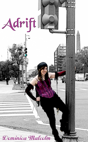
But then it turned out that the photos taken in Washington didn’t have a high enough resolution, and I realised I probably couldn’t use them. Plus, my font choices were atrocious.
The main thing I took away from that process was that I wanted to somehow contrast the past and present — an historical looking character with city features.
In March 2012, I went on a weekend break with my husband to a beach in Kuantan, Malaysia, where we had another Jaclyn photo shoot.
I thought this was perfect — here, I had some great pirate-on-a-beach pictures. I dug through my old photographs from trips to New York City, since the book is set in New York more than Washington, and found some I could blend in and juxtapose with the beach photo. I found better fonts, and played around with that.
This is the one I ended up being happy with at the time:
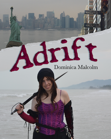
Some people loved it. Some people criticised the fact it was so obviously me-as-the-protagonist on the cover. They thought it was a bit weird, and/or it wouldn’t go down well with readers. Books also don’t often show the character’s whole face. Whilst I had a couple of people who loved the profile shot, I felt like I needed to consider things further.
So, earlier this year, I took a family trip down to Port Dickson in an effort to capture some better pictures that could be used for the cover photo.
I ended up with some great sunset silhouette shots. I still got to have my pirate-on-the-beach aspect, but it was harder to tell that it was me, because I was in silhouette. I also appreciated the sunset because sunsets play an interesting part in the novel itself.
For the New York images, I retained the skyline photo and blended it with the beach picture, which fit well with the horizon of that photo. I removed the Statue of Liberty and Wall Street pictures, realising that simplicity was better.
Then I consulted a graphic designer friend to give me feedback on how to deal with fonts and text placement, and how best to colour the image. That really helped me with the final version:

I’d love to hear from you guys, now. What are some of your favourite book covers? Do you like the DIY approach, or are you someone who is more collaborative when it comes to creative projects?
One random comment will receive a free ebook of Adrift. Please note that whilst comments may be marked as spam, I will still see them and make them visible. The draw will take place at 3pm on August 12th (GMT+8), 24 hours before my crowdfunding campaign ends at http://igg.me/at/adrift. Thanks for participating! The winner has been drawn.

My most recent book purchase where I loved the cover—and the cover was actually the reason I bought it in the first place—was this version of Fahrenheit 451: https://www.goodreads.com/book/show/17470674-fahrenheit-451 I’m not sure if this version is sold in paperback as well, but my copy is hardback, which made it all the more beautiful to me.
But anyway, what I really wanted to comment on was the covers. I had forgotten what your original ideas looked like, so it’s nice to see the progression that was made. I, of course, think the version you went with is much better than its predecessors, but I’m probably biased 😉
LikeLike
That is a very attention-grabbing cover. 🙂
haha, biased or not, I agree with you. Plus, of course your feedback made it even better! I think showing the progression makes a good case for why you shouldn’t settle on the first idea.
LikeLike
I really like that you used yourself on the cover.. I’m going to use my six year old daughter on the cover of my bok Little Girl Lost.. who says you need sell your soul to afford a paid model!!! Good job!
LikeLike
haha, exactly! I know someone else who used their daughter on the cover of a book, and the book I just started yesterday also has the author as the cover model. If it works, why not?
LikeLike
That’s a really lovely cover. Can’t wait to read the book.
LikeLike
Thanks!
LikeLike
I love the covers of Barnes and Noble’s versions of The Complete Sherlock Holmes Volumes 1 and 2! I can’t quite explain why.
And I love the cover of your novel!
LikeLike
That makes me happy! Thank you!
LikeLike